Every clinical diagnosis
is a huge test of memory.
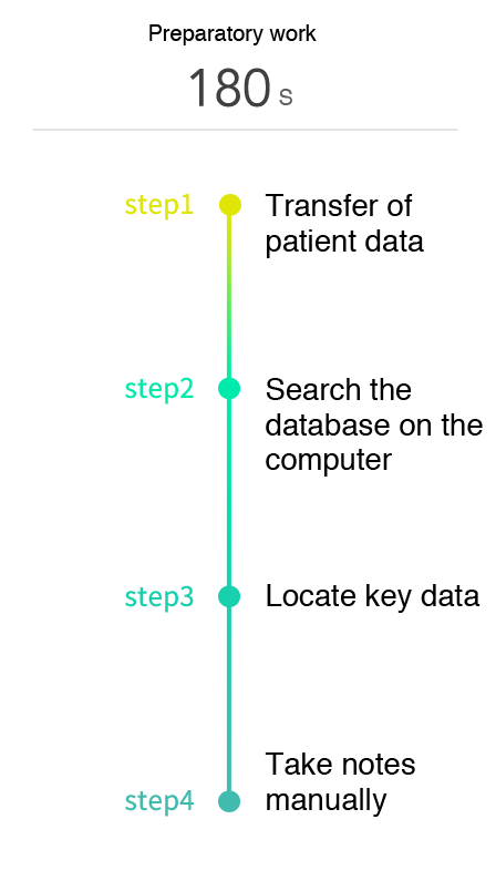
Upon careful examination of the reasons behind the big rush, we came to conclude that the existing medical care information system is not working as well as we imagined. Before doctors make their rounds, they have to search through the online databases on their computers in their offices, locate the key information from all the available data, and copy this information manually onto their notebooks. At the end of the treatment, they will have to return to the office, and key in all handwritten records and doctor's orders back into the system for each patient. The entire process is not only time-consuming, it is a test of the patience and memory of the medical professionals, and also lack timeliness.
Seconds
Preparatory work
0

Transfer of patient data

Search the database on the computer
Locate key data

Take notes manually
Shifting the focus to people,
we re-examined the interactions between doctors and patients.
In addition to addressing the efficiency of medical care services, we are also concerned about the patient's experience and feelings. From registration, examination, to hospital administration and treatment, the patients have much to worry about and often feel helpless. A good experience should not be based on a one-way design, but should also facilitate two-way interaction and address emotional needs.

The key to information is the interface.
We want to create infographics that help doctors understand all they need in 1 second.
For better user experience design, based on what we gathered from interviews and research, we re-optimized the presentation of all information. This allow doctors to understand the conditions of each patient at a glance. Be it an emergency or a case that require special attention, the overall condition of the patient can be understood from the first page of the mobile App in the shortest possible time. The App also sorts medical interventions in order of priority.


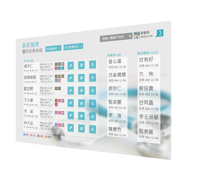
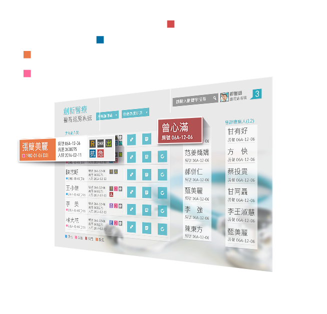
Besides the overview, after accessing detailed information for each patient, the most important tool is the vital signs chart. By summarizing the vital signs on simple charts and tables, coupled with corresponding medication statuses, examination reports, etc., medical care personnel can quickly understand the patient's immediate conditions, and provide appropriate medical assistance. Examination, diagnosis and treatment, all integrated in one interface
It is so much simpler to use that doctors and nurses could
hardly put it down.
After conceptual design is completed, we then returned to the hospitals and conducted interviews and testing with the medical care personnels. Results showed that overall operational efficiency tripled as compared to the old version of the website. Operational satisfaction increased substantially to 97%, and interactions with patients became more timely and effective. Many doctors with nurses exclaimed: "Wow, this is way easier to use!." This does not come as a surprise to us. Excellent medical services should be supported by professional UX design and technologies.
0
%


Operational
satisfaction level
150
times

Effectiveness
in execution
 Previous