The key problem must be identified before we can
innovate and reverse the situation.
A mere visual revamp of the interface will not suffice, we need to identify the key problem. From early 2000, when the first wave of Internet banking hits the market, to the subsequent Bank 2.0, many basic services have been gradually migrated to digital platforms. With Bank 3.0, "bank" is no longer a physical place; it has become an act and service. In view of these changes, we interviewed more than 30 Internet banking users to understand their needs for a wide range of financial services, and the usage context of existing network services.
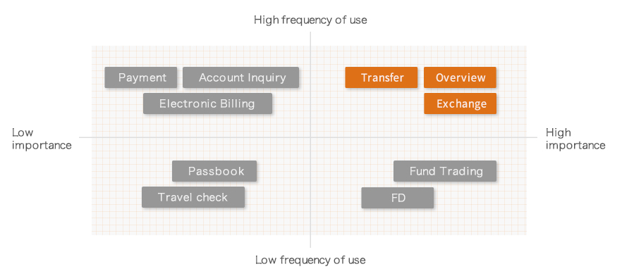
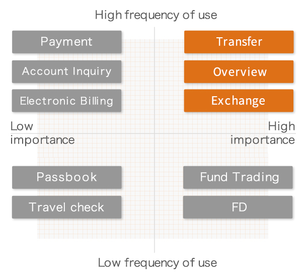
Interestingly, 70% of the respondents said they are familiar with existing Internet banking features, and had not encountered many problems in operation. Upon further probing, however, we found that, the users generally expects more from some frequently used services, such as account overview, fund transfer, and money exchange, etc., and these expectations have yet to be properly met. With every bank offering more or less the same Internet banking services, how then do we restructure the framework based on the users' perspectives, and how do we optimize each aspect? This is the key to emerging as the final winner.
Thinking out of the box, let us reconsider why
Account Overview is necessary?
From the bank's functional point of view, "Account Overview" involves the passive display of various data relating to the account; from the user's point of view, this is more of an active process of understanding himself/herself. Understanding his/her financial status, which leads to reconsideration and realignment, followed by financial management with a fresh frame of mind.
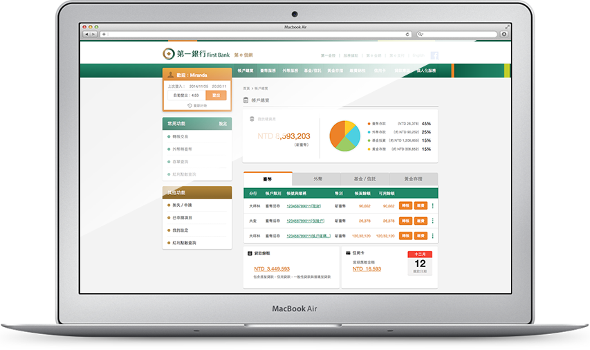


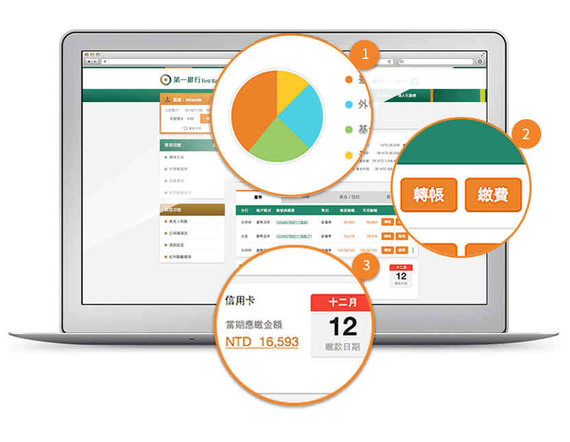
More comprehensive financial analysis
Everything about your financial status is available at a glance - from Taiwan dollars, foreign currencies, funds to gold account, all presented visually in charts and tables.
More intuitive account management
To whom shall I transfer money? Which account shall I use for fees payment? These are questions that come easily to mind. To facilitate more intuitive and simpler use, we added buttons after each account for relevant operations.
More thoughtful credit card payment reminders
Our preliminary studies show that a high proportion of users are concerned about their credit card spendings. Hence, our final design not only provides due date reminders, it also displays real-time credit card balances.
Fund Transfers & Currency Exchange -
How do we improve on these common functions?
Fund transfer and currency exchange are the two most commonly used functions of Internet banking. Despite this, according to our studies, most respondents are very wary of making mistakes while performing these operations, as a slip can result in wrong a transaction value or content.
Notwithstanding this tension,
how then can we improve on the design?
A suitable amount of tension can make the user more focused and careful during operations. A good design should therefore make use of this tension to help the users focus, and complete their goals more efficiently and confidently.
A more comprehensible input format
Typically, the user is required to fill in many fields on a form for funds transfer. To help the users better focus and comprehend, we rearranged the fields into three main groups that are familiar to everyone, namely, the Source Account, Target Account and Value of Transaction.
Highlight the most important information
A lot of information is presented on the confirmation page, but the users are most concerned about the account numbers and values of transactions. We enlarged the fonts for these items and marked them with bright colors, to help the users with verification and confirmation.
A definite end point
To help ease the tension, a message emphasizing the success of the transaction will display at the end of each transaction, with clear icons and text messages.
Disguising advertisements
as great deals for everyone
Marketing through the Internet conventionally involves a lot of graphics, but the click rates are still low. From the perspective of user experience, every action has an underlying purpose and motive. We can enhance communications and guidance, and improve click rates if we can understand the underlying motives of the users. So, instead of cramming in more advertisements, we recommend being more people-centered. We should provide personalized services and reminders to help the users.

Conventional advertising
Conventional advertising takes the form of a Banner. The image is usually very appealing, but once the user realizes that it is an advertisement, he/she will not click it.

Advertising is a kind of motive
Compared to the advertisement itself, action is more important. We hence integrate advertising with the event reminder function, and present relevant information before the time limit of an activity. The motive of clicking is enhanced through the change in the mode of advertisement and the pressure that comes with a time limit. When the user enters a money exchange process, after he/she enters the amount to be exchanged, we will calculate and present to the user how much he/she can potentially save under a 2% offer. This changes the advertisements into an actual actions and thereby enhances the transformation rate of advertisements.
Final design

Final results
Even a century-old brand, with rich heritage in the financial sector, has needs and opportunities for changes. Through AJA's professionalism in UX design, needs interviews, contextual analyses, concept transformations and other rigorous design processes, not only have we given new life to an old brand, we also addressed the structural aspect and helped our customer better understand the needs of a new generation of users. Finally, our design is implemented in the digital services with precision and attention to details This is a new starting point on the road of modern financial evolution, and a turning point that focuses on users.
 Previous