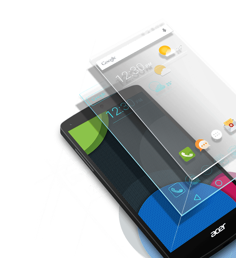
Without clear brand recognition,
Acer is unable to gain more attention amongst users and consequently its market share cannot increase.
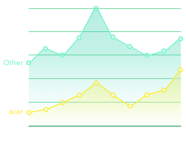
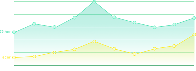
However, what are the outcomes of an overly diversified brand image? We can tell from Google Trends that users' attention and product's market share are directly impacted by the low level of brand recognition. This is the reason for the less than satisfactory sales of the Acer mobile phone after its launch. Hence, the main objectives of this project are to "establish clear and easily recognizable brand identity, provide better user experiences and increase the market share of Acer phones."
Identifying opportunities through multi-level research and analysis.
At the beginning of the project, AJA's research team conducted an integrated study on the trend in mobile phone interfaces over the recent 7 years for 14 brands of mobile phones to identify the opportunities for innovation. At the same time, by focusing on the users' lives and combing through the contexts involved, we tried to understand the types of situations that the users may encounter each day and how the Acer mobile phone can help.


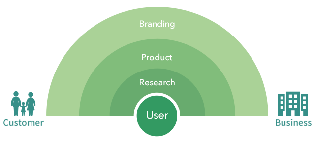
Hinging on a strong partnership involving multi-department
participation and integration to create value!
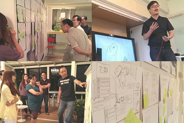
After careful research, we then began the design phase. Unlike typical designs done by ordinary design companies, where the designer is solely responsible for the design work, we invited Acer staff from various departments to participate in the design brainstorming for this project. These include the marketing department, R&D department, business department, project managers , etc. Through this multi-departmental effort, we aimed to perfect the design from different perspectives.
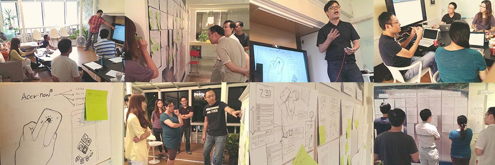
Rigorous processes, meticulous ideas.
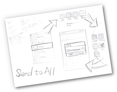
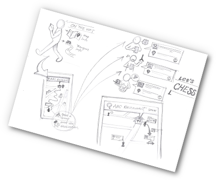
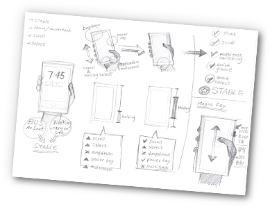
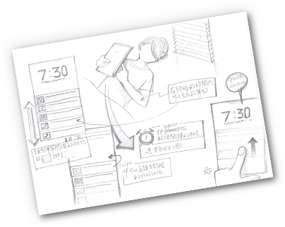
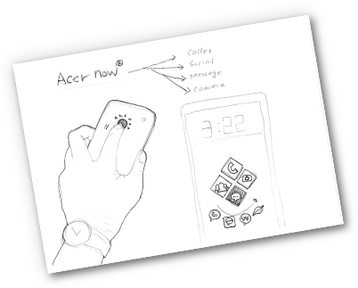
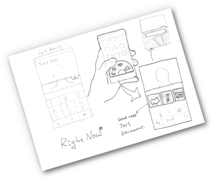
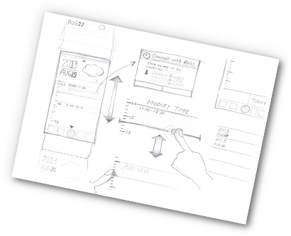
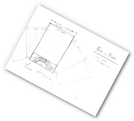
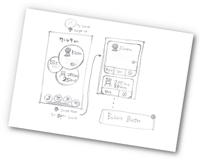
During research and analysis, as well as experience design, the AJA team integrated both rational and perceptual aspects by combining needs analyses with creative designs. Through lean design processes and rigorous discussions with the customer, AJA transformed abstract ideas into concrete designs in the form of conceptual sketches. Good preliminary ideas then led to refined design products!
A brand style with emphasis on personalization,
and the birth of LIQUID 2.0
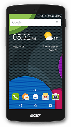
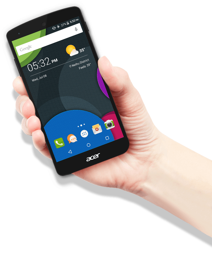
We redefined the brand's style based on the concept of water. As an element, water is able to present different shapes and forms in different containers. We hope that the Acer mobile phone interface is as adaptable as water in its capacity for personalization. We hope to meet specific needs of different users, and create unique and personalized user experience for each user.
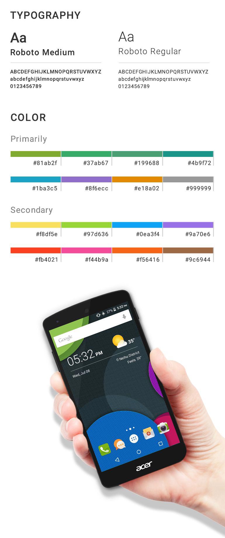
After determining the core concept for the brand, we then went on to setting the basic standards for typography and colors. For color, we used the Acer brand color of "acer green" as the basic color; for fonts, we use Roboto sans serif to increase readability and for a modern feel.
TYPOGRAPHY
Aa
Roboto Medium
ABCDEFGHIJKLMNOPQRSTUVWXYZ
abcdefghijklmnopqrstuvwxyz
0123456789
Aa
Roboto Regular
ABCDEFGHIJKLMNOPQRSTUVWXYZ
abcdefghijklmnopqrstuvwxyz
0123456789
COLOR

Building the Acer brand language,
and establishing easy-to-follow design standards.
The team strongly believes in paying attention to intricate design details and in pursuing ultimate beauty. This is followed by transforming the ideas into concrete design languages. To help users perceive the "Liquid" brand image, we standardized the elements, proportion, composition and sense of dimensions in the pictures. This improved the overall brand consistency, and established a set of design standards to be followed for future Acer product developments.
To ensure that all Launcher Icons are visually perceived to be consistent in size, the actual dimensions must be adjusted according to the form of the item, such that each icon has the same area ratio.
Square base
When the item is too narrow or complex in form, a square base should be added to maximize the area of the icon.
Square shape
When the overall design is based on squares, introduce some slight variations to enliven the design.
Circular shape
When design is based on circles, the icon size should be 10% larger than those in square shapes.
Irregular shape
The design should not be too complicated and should try to fill the entire base; empty space should not exceed 20% of the base area.
Tapping on to our rich experience,
and transforming concepts into designs.
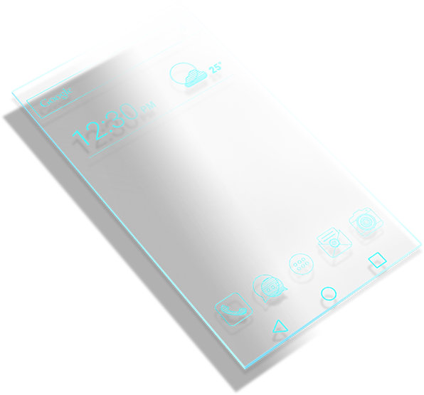
Design is a process involving gradual refinement, from concept sketches to wireframes, to the actual interface; each process requires an experienced designer to contribute to the transformation by adding layer after layer. In this manner, framework, color and dynamic interactive elements are added to the original hand-drawn sketches to produce the final design product.


Not only have we brought innovation to the company, we also brought
profits - annual mobile phone sales increased by five folds.
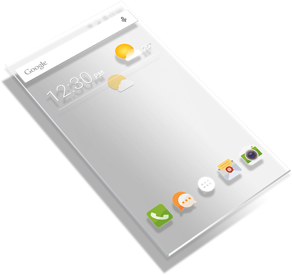
Our strong partnership with Acer began in 2013. During this period of time, the AJA team designed the Liquid 1.0, Liquid 2.0, and Liquid 3.0 mobile experiences for Acer. In addition to designing brand concept and implementing user experience, we drove the annual sales of Acer mobile phones from 1 million to 5 million, and applied for 4 mobile phone user experience patents for Acer. We will continue our work with Acer and build up energy for further innovations, so as to bring more exciting mobile phone experiences to the users in the future.

